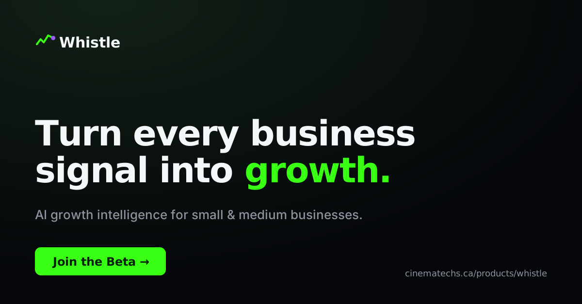
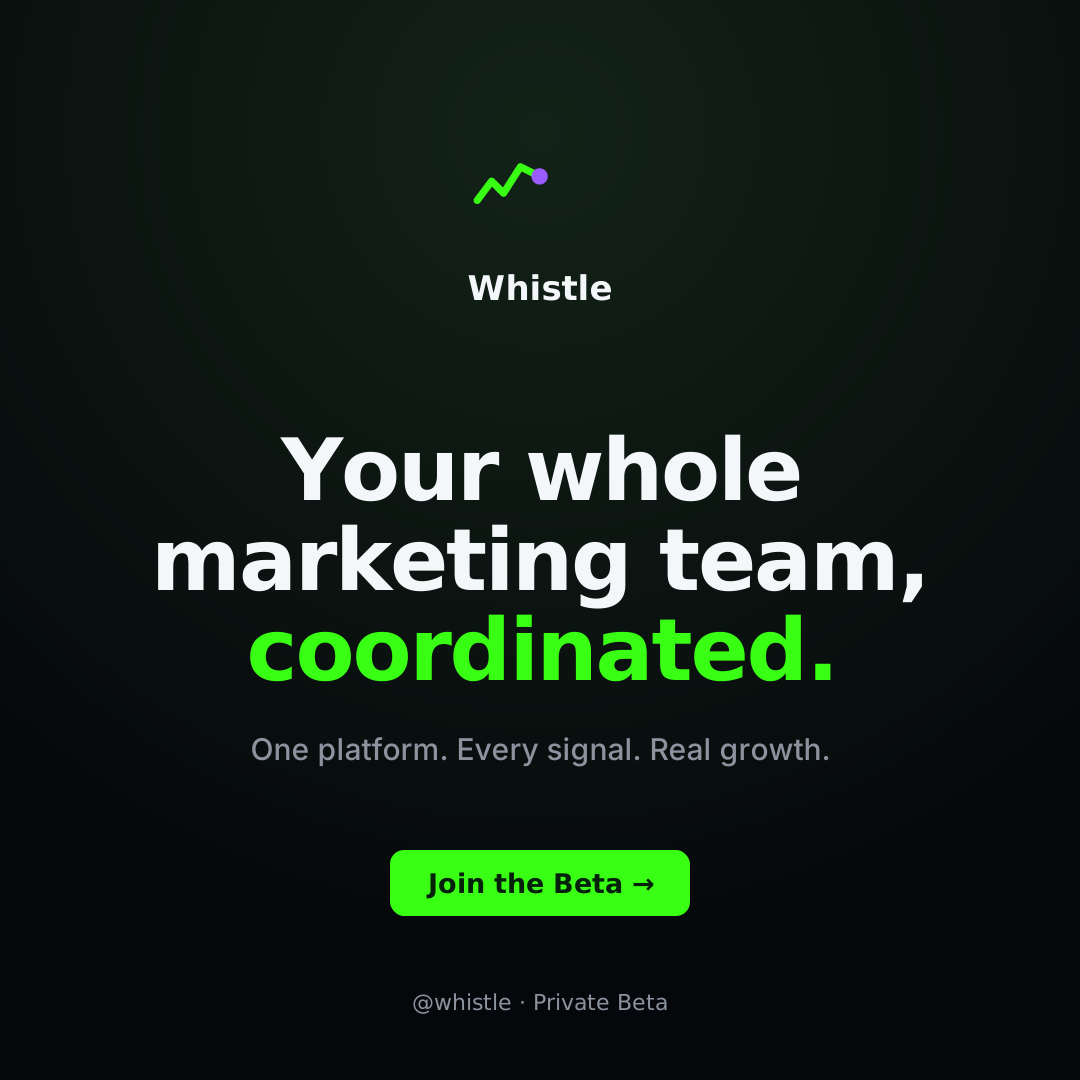
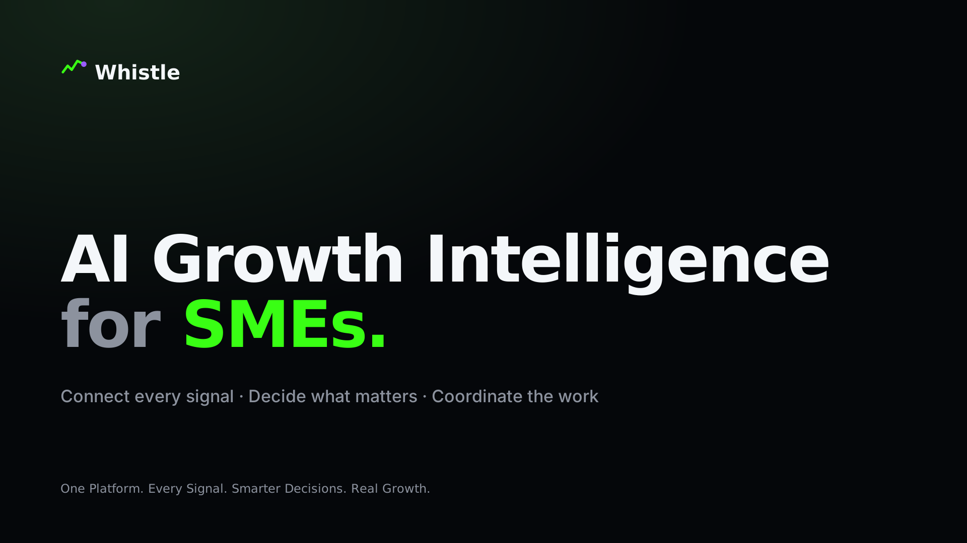
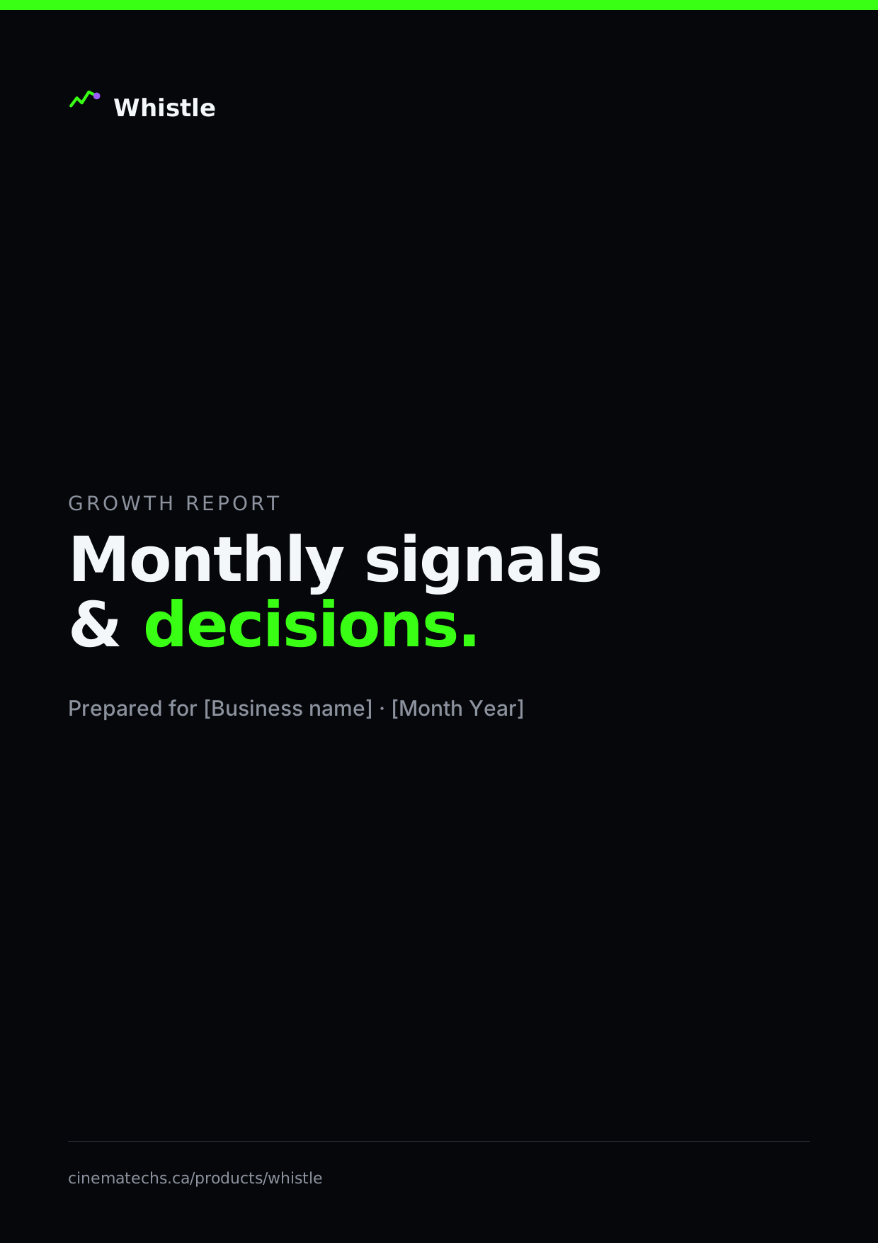
The Whistle brand guidelines.
One connected system — strategy, identity, colour, type, voice, and UI — so every touchpoint feels like the same product. Click any colour to copy it; download logo assets inline.
Positioning & audience
Whistle connects fragmented business and marketing signals, analyzes what's happening across every channel, and turns those signals into clear growth decisions and executable actions. It should feel like an AI-powered CMO and coordinated marketing team built for SMEs.
Archetype
The Strategist (sees patterns) · The Guide (simplifies) · The Operator (executes) · The Catalyst (creates momentum).
Audience
SMEs: local services, e-commerce, hospitality, clinics, gyms, real estate, consultants, creative companies, franchises, and small B2B / internal marketing teams.
Personality
- Intelligent, proactive, clear
- Fast, connected, precise
- Modern & technically credible
- Accessible to non-technical owners
Tagline
One Platform. Every Signal. Smarter Decisions. Real Growth.
The signal-pulse mark
The mark is a rising pulse that reads as a subtle "W" and resolves into a single activation node — Whistle detects the signal, calls attention to it, and creates coordinated movement. Three routes were explored; Route A — Signal Pulse was selected and refined.
Route A — Signal Pulse
A rising waveform subtly forming a "W", resolving into an activation node.
Route B — Connected Growth
Fragmented nodes converging into one growth path.
Route C — Activation Mark
The moment a signal becomes a directional action.




Clear space, sizing & misuse
Clear space
Keep clear space around the lockup equal to the height of the symbol on all sides.
Minimum size
Incorrect usage
- Don't stretch or distort the mark
- Don't recolour outside the approved palette
- Don't add shadows, glows or effects to the logo
- Don't alter the icon-to-wordmark spacing
- Don't place on a busy or low-contrast background
- Don't rebuild the mark from a screenshot
Palette & semantics
Neon green is the primary action and recognition colour — used with restraint. Each colour carries meaning; don't flood sections in neon.
Type system
How Whistle speaks
Direct, intelligent, concise, outcome-focused. Confident without exaggeration. Every claim connects to a real capability or user outcome.
Say this
- Connect every growth signal.
- Know what is working.
- Turn feedback into strategy.
- Move from data to decisions.
- Give every channel one growth strategy.
Not this
- Revolutionize your journey
- Unlock limitless potential
- Harness the future
- Game-changing AI
- Transform everything
Motion principles
Do
- Signal lines moving between platforms
- Cards entering in logical sequence
- Numbers counting only when visible
- Subtle glow changes for active states
- Reduced-motion support, always
Don't
- Constant floating objects
- Excessive parallax
- Random particle explosions
- Fast flashing or neon that hurts readability
- Motion that delays access to information
Core components
Buttons
Status badges
Social & document templates
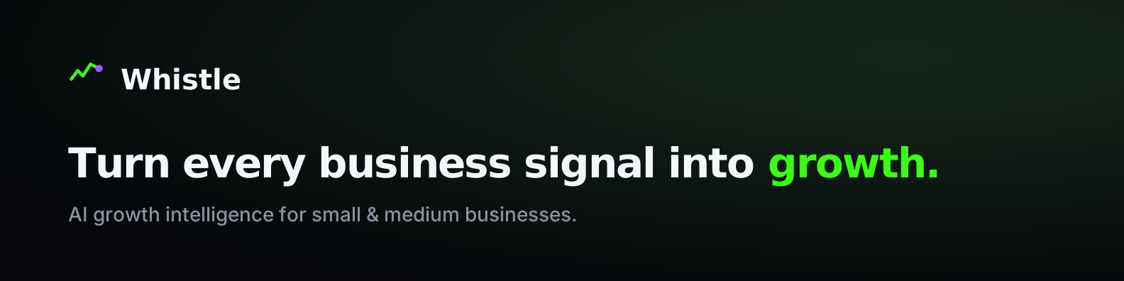
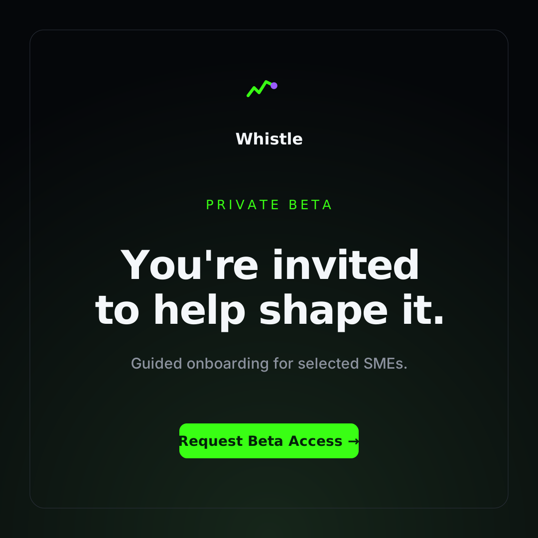
Starter examples built on the Whistle system — same mark, palette, and type. Editable SVG; swap the copy and export.